Accessibility in B2B Applications
Sometimes, a small change can have a big impact – often without us realizing it beforehand. Take, for example, the automatic door openers that were increasingly installed during the COVID-19 pandemic. The goal was to reduce contact with door handles and prevent the potential spread of illnesses. Now, it’s clear that these automatic door openers offer another major benefit: people in wheelchairs, those using walkers, parents with strollers, or even anyone carrying two full shopping bags – all can now pass through doors effortlessly. Senior UX Designer Christophe Chan-Hin has observed this phenomenon closely and asked himself: Why did it take a pandemic to remove this barrier for so many people? In this blog post, he explores the European Accessibility Act and its impact on B2B applications.
The effect described in the introduction is known as the curb-cut effect: a solution originally designed for people with disabilities (or, as mentioned above, for a specific purpose during the pandemic) also benefits the general public. We will observe a similar phenomenon with the European Accessibility Act. While its primary goal is to enable people with disabilities to have barrier-free access to digital offerings, it will quickly become clear that some features and adjustments also make applications easier to use for people without disabilities. The law initially applies to B2C applications. However, it will soon become evident that B2B applications should also follow suit in terms of accessibility.
Background
The “Barrierefreiheitsstärkungsgesetz” implements the European Accessibility Act in Germany. This initiative did not emerge from a vacuum and is not starting from scratch: The United States has had the “Americans with Disabilities Act” (ADA) since 1990, which was expanded in 2008 to include digital applications. Additionally, the Web Accessibility Initiative (WAI) has existed since 1997. As it originated from the World Wide Web Consortium (W3C), accessibility has long been part of web standards.
Accessibility is defined as follows:
“Web accessibility means that websites, tools, and technologies are designed and developed so that people with disabilities can use them. Specifically, people can:
- perceive, understand, navigate, and interact with the web
- contribute to the web”
Why is accessibility important for digital applications?
Looking at the numbers for Germany, it becomes clear how significant this issue really is:
- 7.9 million people in Germany have a severe disability.
- 2.8 million people have a mild disability (e.g., limited motor skills or reduced hearing).
- Around 40% of the population live with one or more chronic illnesses.
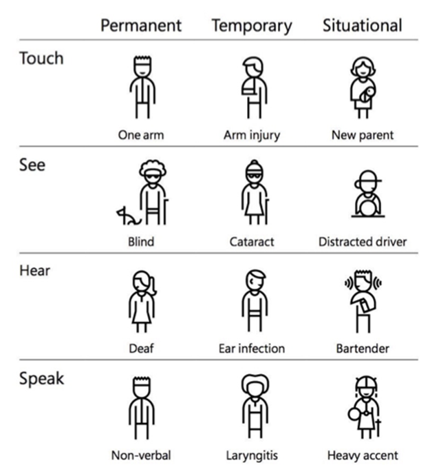
Not every disability or impairment is visible. Disabilities and impairments can affect motor skills, vision, hearing, speech, and cognition. They can be permanent, temporary, or situational.
Accessibility is a core area of UX. And of B2B.
When designing applications without considering accessibility, serious mistakes can occur. For instance, 12.1%* of the working population are functional illiterates – fully capable of performing their jobs, sometimes even in sectors with severe skill shortages. Let’s consider the following scenario: we are developing an application for truck drivers. At first glance, it might seem absurd to think about accessibility for blind or visually impaired users in this context. However, this is actually a situation where this group could greatly benefit from simply following accessibility guidelines for the visually impaired:
- One in four* truck drivers is a functional illiterate.
- In a European context, some drivers may not speak German.
- The driver’s eyes are inherently occupied with the task of driving. Additionally, another application, such as a navigation device, may already be in use.
(Source: https://leo.blogs.uni-hamburg.de/)
When we ensure that blind users can access an application, the technical aspect involves making screen readers accessible. This means that visually impaired users can have text read aloud by a device. It sounds simple at first, but the code must be written in such a way that the screen reader can distinguish whether it’s a navigation item, content text, or a button. Anyone who implements this has met all the technical requirements for text to be read aloud.
B2B is also shaped by accessibility.
As a long-time member of the SAP AppHaus Network, we follow the Human-centered Approach to Innovation. The user is always at the center of our actions. In the design process of an application, this means (according to Kat Holmes): identifying exclusion, learning from diversity, solving for one person, and scaling to many. Here are a few examples from our daily work at sovanta that show how important accessibility guidelines are for users:
- In the design phase for a mobile application for foremen on a construction site, we noticed during UX research (i.e., interviewing and observing) that all mobile devices were protected by a case, which significantly reduced the display contrast. Additionally, the work is done outdoors, and sunlight further impaired readability on the mobile device. Fortunately, the Web Content Accessibility Guidelines (WCAG) address the issue of contrast for people with visual impairments and help us as UX designers create more accessible applications.
- In a project for warehouse workers in a cold storage facility, we quickly noticed during UX research that they all wore gloves. This seemed obvious, yet it was completely overlooked when planning a paperless warehouse tablet application. Ultimately, gloves are just a temporary limitation of fine motor skills, and again, we found useful recommendations in the WCAG guidelines on what to consider in UX design.
- Around the age of 45, nearly everyone begins to experience farsightedness. This affects all screen-based work: the ability to adjust font sizes in a responsive design – one that adapts fluidly – means that the application can potentially be used without glasses.
- Almost 9% of men and 1%* of women have color blindness. However, many apps rely heavily on red and green for validation and error messages. A dashboard that doesn’t account for color blindness in its charts can actually become unusable.
(Source: https://gesund.bund.de/farbenblindheit)
Good news: SAP Fiori stands for accessibility.
There are actually very few use cases where it’s not important to consider accessibility. SAP customers have a mature design system at their disposal with SAP Fiori, which aligns with the WCAG 2.2 guidelines at both the framework and app levels. Want to know how to successfully implement Fiori? Feel free to reach out to us.